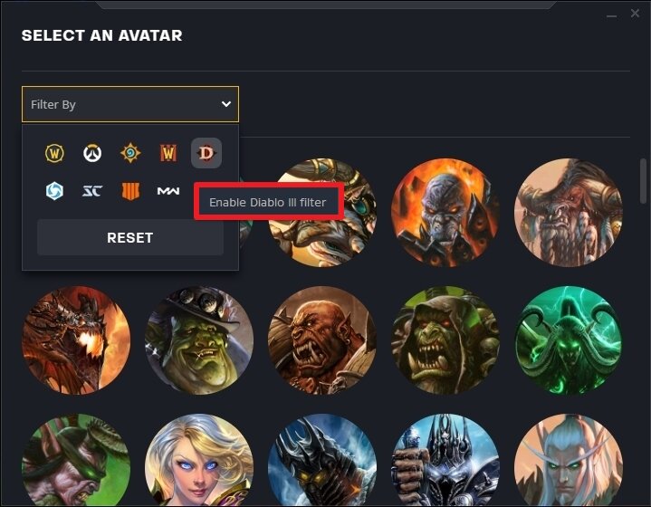
The Battle.net Desktop App was developed after I joined the UX team in 2015. I worked with several designers to figure out the most intuitive wording for our users for menus like this one.
There are special considerations to take into account for gaming environments; use of terms like “Avatar” and “Redeem a Code” were necessary for this menu in order to maximize the most used Blizzard features.
When a player wanted to change their Avatar (which visually represents them in chats and on the Friends list), the text needed to be minimal to account for translation, usability, and accessibility. In some flows, I recommended we remove all words and stick to simpler images, with descriptions for screen readers.
Players are familiar with the game logos, so that made image use a bit simpler.
I included each character’s in-game label so they’d be easy to recognize, no matter how long it’d been since the player last logged in.
I recommended that we keep confirmation clean and simple, with a green tick to indicate the change completion.


